Gale Force Nine publishes official, licensed Spellbook Cards for Dungeons & Dragons 5th edition. Spell cards are great; I've used from for 2nd and 4th edition games and loved em. But I'm disappointed with Gale Force Nine's.
(You can discuss this post at 1000d4.)
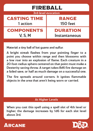
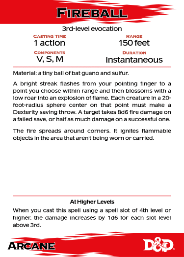
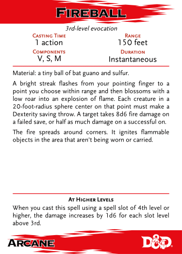
This is one of Gale Force Nine's cards, pulled from their website.
The cards are 3.5" by 2.5", standard poker card size. I preferred the 3" by 5" cards from the second edition spell cards, but these are servicable.
The cards are entirely functional and relatively easy to search through. The information you need is present. But, I was disappointed. They look drab, they're overly busy, and the wrong things are emphasized. Here are some ideas for improvements.
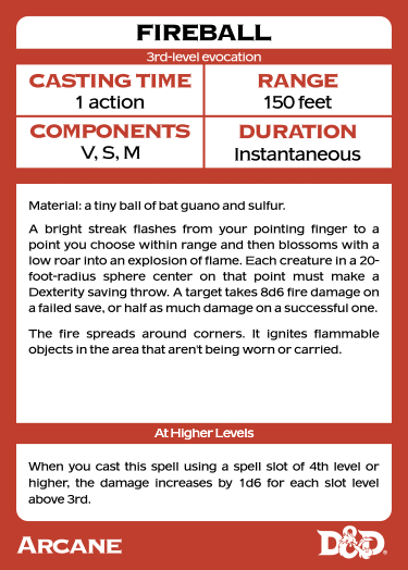
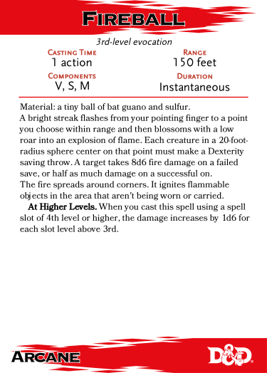
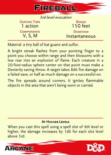
This is a re-creation of the card, provided so we have a more direct reference point for my revisions.
I don't have access to the exact fonts (nor can I justify dropping $50+ just to write this article), so I'm using the closest matches I could easily find. The original cards appear to use Modesto Expanded for the titles; I cannot identify the font used for the body text. I've substituted a Copperplate Black for the titles and URW's American Gothic for the body text. I've tuned the letterspacing of both fonts to try and match the space used and general "feel" of the original; graphic designers, I ask you to forgive me this crime.
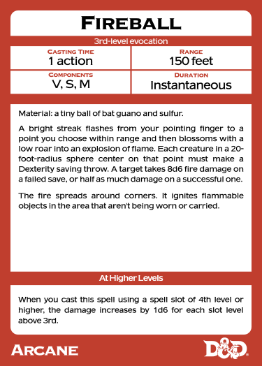
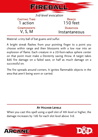
The most obvious first step is to make the fonts for the labels smaller. They're highly redundant information, identical across all cards. Any player who uses the cards will quickly learn which pieces of information are where.
As a bonus, making them smaller lets me tighten up the block at the top, opening up more space for the body text in the middle, potentially allowing for a larger font. I've also used some of the space to make the "Fireball" a bit larger.
The font they're using has small caps; it's odd that they didn't use them. The small difference in size breaks up the uniformity of the shapes a bit, creating a bit more interesting.
Were I to continue down this route, I would actually put the labels in the left corner of the box. First, this recalls forms that people fill out, relying on existing expectations to reinforce understanding. In addition, moving them to the side lets me tighten up the boxes at the top even more!
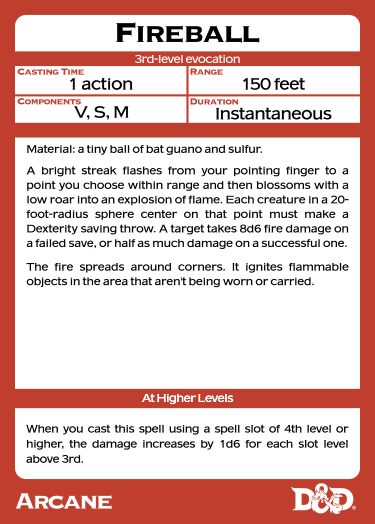
But, that's not the route I'm going down. Let's get radical.
I've made a bunch of changes here. First, I threw out the heavy boxes. They were adding nothing. I added the official D&D swoosh; use the existing branding! Finally, move to using the red of the official swoosh; the red Gale Force chose is muted, while the official red is much more alive.
Against the strong red, white is relatively subtle, so I've gone with black text with a white border for the spell title to improve legibility against the background pattern.
Without any boxes, the middle of the card ran together, so I added some modest red rules to break it up. Even with the rules, I've tightened up the card even more.
But what if we mirrored Wizards of the Coast's original design even more closely? The spells have a particular layout in the book, let's replicate it...
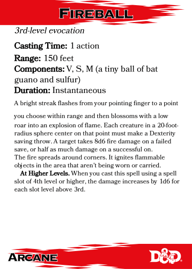
This is just awful. It matches the Player's Handbook layout, but what looks nice in page after page of spells looks pretty wretched in small type on a lone card.
(Here I'm using Bookinsanity as a replacement for Bookmania.)
Perhaps if we hybridize with the previous design?
For small type in the D&D books, Wizards of the Coast is using Scala Sans. It's attractive, readable at small sizes, and matches the brand. Let's use it instead of the font Gale Force Nine chose. Or, at least let's use Scaly Sans, a free knockoff. (See here for fixed versions.) I've italicized the level and spell type to match the style used in the Player's Handbook.
The spell names in the Player's Handbook are probably set in Mrs Eaves Small Caps. It's an elegant look in the book, but it's too weak here, even in large sizes, and even without the swoosh in the background. So I stuck with the my "Modesto". I believe Wizards of the Coast is using Modesto Bold Condensed for titles, and that would likely be an excellent choice. Sadly, I don't have easy access to a similar font.
All in all, I'm reasonably pleased. However, the body text is still busy and dense.
I believe part of why Wizards of the Coast chose Scala Sans is that it's legible in small sizes. They use it for more than just tables; stat blocks are set in Scala Sans. So let's just set the body in Scala Sans. While I'm at it, I'll restore the inter-paragraph spacing to get a bit more white space, and will break out the "At Higher Levels" as it was before.
I've held the font size the same to emphasize that this layout will work for all of the spellbook cards. Scala Sans is a bit too small here.
All of this work has opened up more a lot more space for the body text, and Scala Sans is a narrower font. If we tighten up the inter-line spacing a bit, I believe the font size could be bumped up a half-point or a full point, dramatically improving the readability without using significantly more space.
This is a full point increase (from 5.5 to 6.5), and it's at least as readable as the Gale Force Nine font.
If I was doing an entire set of cards, I would leave the inter-line spacing as it was by default, and only tighten it if it was necessary for a given spell. Only if that still wasn't enough would I make the font smaller.
The official books use a subtle, slightly yellow background texture, evoking parchment. I'm replicating it here simply as a color, not a texture. This is a tougher call. I like it, but it doesn't quite mesh with the swoosh.
Extending the yellow into the swoosh area looks off; the colors don't go together. A black background, similar to the swoosh's use on the book covers, is even more jarring. A white background for the swoosh is the best compromise.
I think matching the book design and slightly reducing the contrast are worth it, but I can certainly see an argument with sticking with a white background.
So here is a before and after. My design better evokes the Wizards of the Coast brand. I believe it's also easier to use, largely by reducing unnecessarily clutter and complexity.