
Kingsport Festival: The Card Game is an amusing card and dice game. Players are various dark cults, trying to become powerful by calling upon favors from alien entities in the Lovecraftian style. Each turn players roll dice to see what resources they have (Evil, Death, and Destruction), use cards to modify those resources, and use the resulting resources to buy more cards. Purchased cards are not a hand or deck; they are a set of available powers available every turn.
It's a fun game, and an interesting derivative of the original Kingsport Festival, which itself is an derivative of Kingsburg.
But, the user interface could use some work. The cards representing the Elder Gods* have some weaknesses that can be improved.
* The game uses the term differently than most Lovecraft inspired works, including creatures like nightgaunts and Mi-Go.
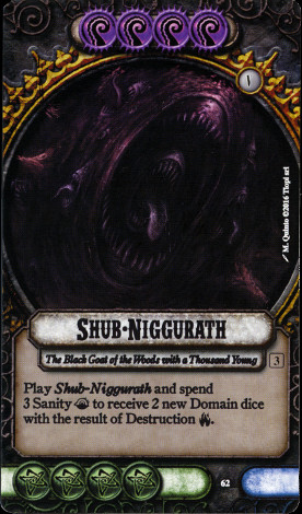
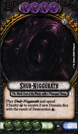
The Elder Gods are sorted into 6 levels, listed as Roman numerals from I through VI. Nephren-Ka is the weakest (and cheapest) at I, while Azathoth is the only VI.
Here are the six numbers, as they appear on the cards:
They're just as hard to read on the original cards. The right line on the V is too thin, making them look a bit like another I. That the cards are just a bit blurry makes it worse.
The solution is straightforward: choose a font with stronger lines.
Instead, one could use actual numbers, but numbers in roughly the same range also indicate the number of players required to use a given card. using Roman numerals eliminates the ambiguity.
Next, each card has a number indicating the minimum number of players to include the card in play. It's a small number in a box on the right side of the card. It's a little subtle; lightening its background might make it pop a bit more.
Finally, the rules text itself is low contrast against its background. While the moderately dark background is evocative, it needs to be lightened for the sake of readability.
Given just this, here is a before and after:
| Before | After |
 |  |
Those are all relatively small changes. The deeper problem is the rules text: there is too much of it.
The selection of 20 cards is sitting on the table, each one available to purchase. Players will often be looking at them sideways or upside down, across the table, and in non-ideal lighting.
Here is the rule text from all 20 card types. Picture wanting to quickly scan all of those in play to decide which one you want to purchase.
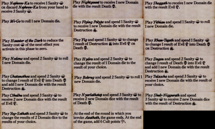
(I've brightened the background, improving the contrast. The low contrast in the originals makes them even harder to read.)
If we can trim this text down without losing anything, we can make the text and icons larger and easier to read.
Here's what a typical section of rules text looks like:
Play Shub-Niggurath and spend 3 Sanity 👁 to receive 2 new Domain dice with the result of Destruction 🔥.
(The icons are rough approximations of the actual icons.)
The form is common for 17 of the 20 cards: "Play Card-Name and spend X Sanity 👁 to gain some benefit." That's a lot of unnecessary wording.
We can just drop "Play Card-Name and" entirely; it's useless.
The only price ever paid is in Sanity, so we can just say "Cost: X Sanity 👁 ". And they've got the icons; use them! Now we're down to "Cost: X 👁 ".
The benefits fall into two general categories: gain a new die, and convert a die from one result to another. The various die results also all have symbols. So instead of "receive 2 new Domain dice with the result of Destruction 🔥" we could just say "+🔥 & +🔥".
Really, let's just go all in on the symbology. For 17 of the 20 cards, we can replace all of the text with symbology using icons already present in the game, just adding "+" to mean "gain" and "→" to mean "change result to".
Here's my proposal:
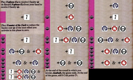
(Again, this is against a lighter background.)
I've removed the "Cost:" entirely; the sanity price is simply 0, 1, 2, or 3 Sanity icons in the purple area on the left. It's purple to match the dice used to track sanity.
The die result icons are colored to match the dice themselves, and placed in boxes to both improve contrast and emphasize that these are dice. (The actual dice are grey, but going with white improves the contrast and readability.) A question mark in a box is used to mean any result, both for "+?" meaning "gain and roll a new die" and "?→" to mean "change any die." When there is a choice, they are separated with slashes.
These are far easier to read in actual play conditions. As a bonus, most of the cards are easier to read for non-native-English readers, making the game a bit more accessible.
For 3 of the cards, I'm punting, keeping the original text. They could be trimmed a bit, at least removing the name of the card, but the rules are don't fit the pattern and aren't easily represented in pure icons. Creating special icons for each of these three cases would only increase confusion. Still, having only 3 cards you actually need to read is better than 20.
This isn't particularly innovative work; using symbols is in this way is common across a lot of games. Most of the target audience will be familiar with the general style.
It's certainly possible to go overboard; Race for the Galaxy is a brilliant game, but it takes multiple games of decrypting the symbology to become fluent. But in this case, there are only 4 nouns and 2 verbs, and I believe they're straightforward enough.