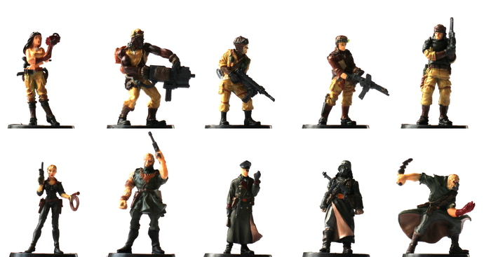
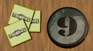
A staged example of how Tannhäuser might look in play. The table is 3 feet by 5 feet. (The white and yellow cards are third-party reference cards designed to speed play. The rules have been rebound with coil binding after the glue-binding failed.)
A staged example of how Tannhäuser might look in play. The table is 3 feet by 5 feet. (The white and yellow cards are third-party reference cards designed to speed play. The rules have been rebound with coil binding after the glue-binding failed.)
Tannhäuser, in its Revised Edition form, is an entertaining 2-player skirmish combat game. World War I has continued through 1949. "The Union," equipped with alien technology from the Roswell crash face off against the Nazis Reich armed with the power of the occult. Each side fields 5 soldiers: 3 named characters and 2 weaker Troopers. Moody, detailed maps are covered with circles where a soldier might stand. Each circle has one or more colors, indicating which other circles it has line-of-sight to.
The different technologies mean the game is very asymmetric, but the game feels reasonably balanced. There are plenty of interesting decisions to made. I suspect that in more serious play, the game bogs down as players are constantly considering the ramifications of the 40 pieces of equipment in play. But playing casually, I enjoyed it.
But this isn't a review of Tannhäuser the game, this is an analysis of Tannhäuser's user interface. Here the game flounders, badly. It makes a number of mistakes common to 2000s Fantasy Flight games, and it's instructive to consider what went wrong and how the interface might have been improved.
There are a few root causes behind most of the problems.
Many of the problems can be summarized as: everything looks the same. Much work was put into making the components attractive. They're appropriately moody. Effort has been put into ensuring that you can see and appreciate the art. But not enough effort was put into ensuring that the players can easily see the important mechanical elements.
All tokens in Tannhäuser are the exact same size and shape: 1⅛ inch diameter circles. This slows down sorting and recognition, and causes additional challenges that I'll touch on later.
Colors were not carefully considered. For players with red-green colorblindness, about 8% of all men with Northern European ancestry, many essential differences are difficult or impossible to discern. Even for players with full color vision, failures to consider sub-optimal lighting conditions and the complexities in human vision render some essential differences tricky to discern.
What a health indicator might look like in play. It's not clear if it's on the first or second row.
Each character has three or four rows of characteristics. They start using the top (and typically best) row of characteristics. Each time they are wounded, they move to a lower row. When they run out of rows, that character is dead.
To indicate which row is active, a token, a "health indicator," is placed next to the rows. There is a mark along the edge of the token. Players are expected to rotate the token so that the mark is parallel to the currently active row. This is a mess.
The mark on the edge of the token is relatively subtle compared to the art on the token, and a bit away from the edge (probably to avoid the risk of it getting cut off due to slight cutting errors). The next result is that it takes a moment to find the mark. More seriously, because of the distance from the token to the characteristics, it can be difficult to determine where a token is pointing. A relatively slight bump of the table could cause a token to slightly move, making it difficult to identify the active row.
We can fix this without changing the shape of the token. First, improve the contrast between the icon and the background art. Second, run a distinct line all the way out to the edge. Finally, add a line from each row of statistics.
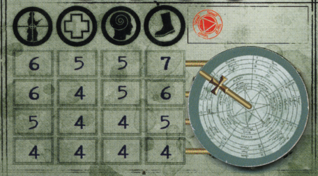
While still ambiguous, it is decidedly closer to the first row.
If we can change the physical components beyond printing, we could have a cardboard frame to wrap the current level. As a bonus, this means that the column heading would be immediately above the relevant characteristic. It's a small thing, but should slightly speed looking up a number.
On top, the Union:
Aponi,
Brown,
MacNeal,
Alpha,
Delta.
On bottom, the Reich:
Krämer,
Zermann,
Von Heïzinger,
Shocktruppen,
Strosstruppen.
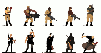
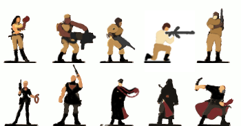
Simplified forms of the miniatures showing general shape and coloring.
Given the fanciful setting, the character designs are regrettably bland. This matters when quickly identifying which miniatures correspond to which characters. On the side of the Reich, Von Heïzinger and the Shocktruppen are both tall, dark, relatively narrow shapes. On the Union, MacNeal, Alpha, and Delta are all generic white guys in khaki holding guns. Alpha and Delta are wearing darker tops, breaking up the distinct khaki look of the Union and making them a bit ambiguous with the Reich.
A few characters shine. I roll my eyes at Aponi's crop top and Krämer's dominatrix outfit, but they're distinct. Brown's muscles, large weapon, and stance make him distinct, while Zermann's sheer height and bare arms do the same for the Reich. The Strosstruppen is an absolute gem, distinctive, full of character, and a pose suggesting he's in action, not posing for a photograph.
One possible way to adjust the colors to improve recognition
In a redesign, first I'm make the colors clearer. Additional colors are a great way to distinguish figures, but the core colors need to remain unique to each side. Let the Reich keep the dark colors and keep the Union in lighter colors. Get the dark colors off Alpha and Delta. Remove the slightly odd khaki lining on the Shocktruppen's coat. For secondary colors, perhaps give the Reich a wine red, and the Union some creams.
The Union's mixture of groups is part of what distinguishes it from the Not-the-Nazis-For-Legal-Reasons Reich; play it up! Obviously Brown has some African ancestry. Aponi is Native American, but it doesn't really come through in the miniature. I'd add to this, perhaps giving Alpha ancestry that can be conveyed given the limitations of paint quality and plastic molds. Perhaps Chinese?
Adjusting the poses of Alpha and Von Heïzinger to be more distinct.
For the more similar characters, adjust their poses to make them more distinct. Move to more dynamic poses. I'd start with putting Alpha on his knee, sighting down his gun. MacNeal is supposed to be a leader, maybe have him signalling with one hand. While Von Heïzinger's gripped fist is evocative, it's barely visible on the table. He's always carrying the Patmos Amulet, slap a heavy chain on that, hang it around his neck, and have him thrusting it forward like the magical weapon it is.
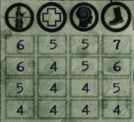
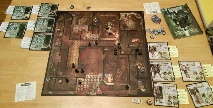
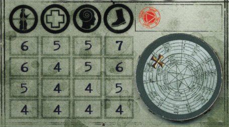
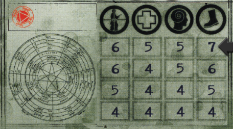
Karl Zermann's characteristic block. The top row is used until he is wounded. From left to right, the columns are Combat, Stamina, Mental, and Movement.
Tannhäuser: Revised Edition is incredibly impressive. The designers created a radically different, superior game from the original edition under the constraint that none of the components could change. This was handled with incredible grace with one stumbling point: tests.
Tests are how random things are resolved; mostly shooting at each other. In the original game you would take a character's relevant characteristic (often "Combat") and roll that many dice. Each individual die would be compared to the opponent's relevant characteristic; each die that met or exceeded the characteristic was a success.
In the Revised Edition, the number of dice rolled is more constrained; it's typically 4, typically varying based on the size of the gun. The target number is 10 minus your own character's relevant characteristic. For example, using first row of numbers above, the target number to shoot someone is 10−6=4. Any number from 4 through 10 is a success.
It's that subtraction that adds an unnecessary complication. People subtract more slowly than they add. It's a small thing, but little details matter.
The ideal fix would be to reprint the character sheets with the calculated results.
Given the constraint that the cards cannot be changed, there is a clumsier, but still better than subtraction option. Interpret the "0" on the dice as 0, not 10. Now, instead of trying to roll equal-to-or-greater-than, you need to roll equal-to-or-less-than. So with the above example, the player would need to roll a number from 0 through 6, inclusive, to shoot a target. 0 would become an automatic success and 9 would be automatic failure.
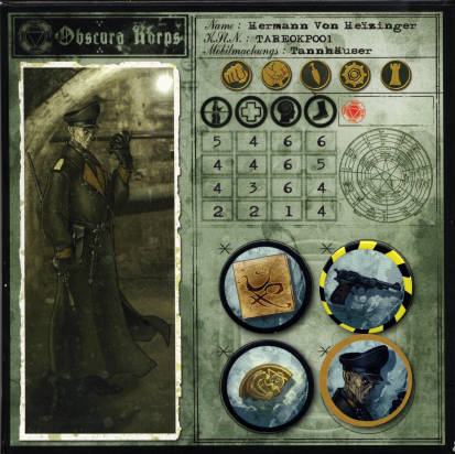
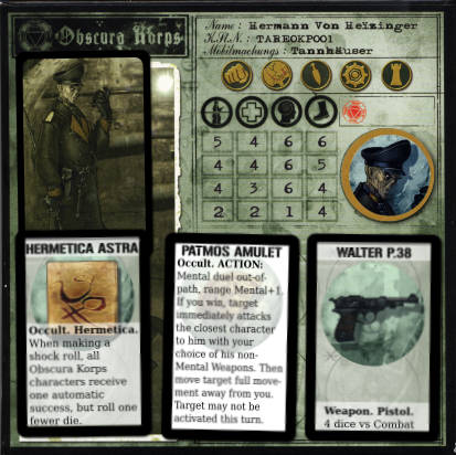
Von Heïzinger's character sheet with four tokens. The Eye of Tages is face down, showing his face, to indicate that it has been used.
For the Revised Edition designers, the equipment tokens (which includes a character's skills and inherent aspects) were a gift. The only thing on each token is a picture, freeing them to assign whatever rules they liked, even renaming them.
For the player, the equipment tokens in either edition are a white elephant of a gift. A full game has 40 pieces of equipment in play at the start. Omitting identical rules, there are still about 30 different special case rules to be aware of. The Revised Edition book comes with no reference sheet for them. Instead, the rules are scattered across 20 pages in the book. To add to the challenge, some of the token pictures are very similar, especially Von Heïzinger's Hermetica. New players are going to spent a lot of time checking and re-checking the rules.
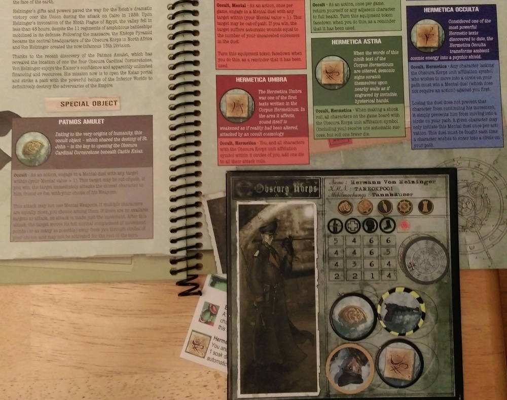
Comparing Von Heïzinger's equipment tokens to his two pages of
reference in the book. Which of the 3 Hermetica is in play?
(Peeking out from behind Von Heïzinger's card is
a
third-party summary sheet. The rules have been rebound with coil
binding after the glue-binding failed.)
The real fix, for both editions, is to not use tokens, but small cards. While they occupy more space, the equipment's name and rules can be printed directly on the card. The cards can be cozily fit in the existing token space, or spread out using the character's portrait space.
Von Heïzinger's character sheet using cards instead of tokens. One of Von Heïzinger's tokens is being used to indicate which character he is, since his art is now covered. The Eye of Tages is face down, showing his portrait, to indicate that it has been used.
One of Brian M's reference cards.
Given the constraint to change nothing, the revised edition needed to include a reference sheet or sheets, ideally broken up by character. (Brian M did exactly this, and I recommend his cards to anyone playing.)
Union and Reich command point tokens. 0 is on the back of 1, 2 on the back of 3, and so on.
It's not clear which of these are 9s and which are 6s.
What the command point tokens might look like, next to an actual one.
Each player has a set of 5 tokens, with the 10 sides numbered 0 through 9 across them. These are used to track the current number of command points. They're a nuisance, as sometimes you flip a token to reach the next number and sometimes you pick another token. They're overkill, since typically a player will have no more than 3.
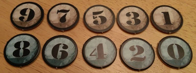
A related problem is that the 6 and 9 tokens are ambiguous. You can deduce which direction is "up" by comparing the background or die cut angle to other tokens, but that's a needless complication.
The tokens should have been unnumbered; the number of tokens you have is how many command points you have. A different size or shape would also make them more distinct. A smaller size would allow for 9 tokens per player without using more cardboard. If the smaller tokens were neutrally designed, a single pool could be used by both players. I would go with half-inch, square tokens.
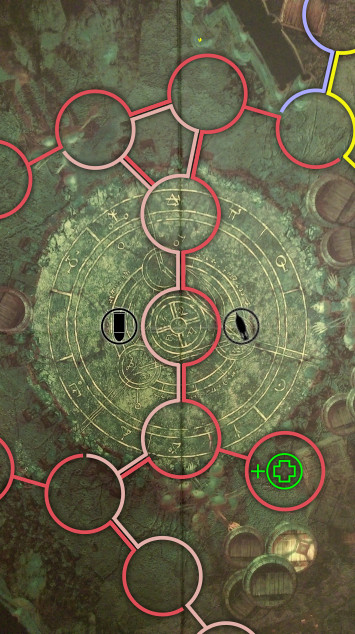
A number of tokens may be placed on the board during play: rubble, equipment, items, overwatch, and smoke. However, the tokens are almost exactly same size as the circles on the board. If exactly placed, a token will conceal the circle and it's important color information. If set off to the side, part of the color can be seen, but that may not be enough for circles with multiple colors.
Here I would slightly shrink the tokens. In addition, making the lines of the circles wider would help.
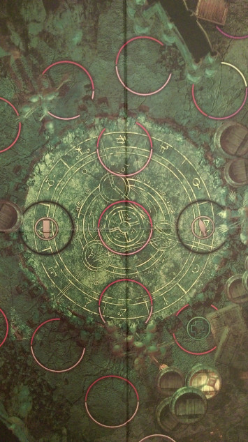
The board has a number of problems.
All of the circles on the board are spaces a character can move into. Except the black circles. Those you can never move into. The black circles should have been some other shape, or at least a significantly different size.
Similarly, circles of any color may have a small icon in them. Some indicate a rules change if a character stands there. Some indicate that an adjacent character may take a special action (Action circles and Objective circles). It's not quickly clear which are which. Again, changing the size or shape of the black circles would fix the problem, as the Action and Objective action circles are all black circles.

In this example from the rules, I have a difficult time telling if the cross-in-circle icon is green or red.
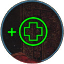
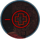
What the icon might have looked like.
The circles which modify a character's attributes consist of an icon, matching an icon on the character sheet, and a color, red to indicate a penalty, and green to indicate a bonus.
Red and green, at similar levels of brightness, with a gradient, in small icons on a busy board, probably in non-optimal lighting. As someone who is red-green colorblind, I can assure you that those colors are very similar.
Perhaps surprisingly, I would not recommend changing the colors. Red and green have very clear associations of bad and good. The solution is to make them more distinct. First, eliminate the gradient to reduce complexity. Select a very vivid red and green; most red-green colorblind people can distinguish red and green, provided they are vivid. And finally, put a − or + next to the icon to act as redundant information.
The color of the circles matters a great deal, as it indicates which "paths" a circle is part of, and thus which characters can see which other characters. But overly subtle color choices against complex background, and perhaps some outright mistakes can make it hard to tell which circles are the same color.
These three circles all appear to share a single color, purple, to me. Based on the positions of the circles and the walls (in solid black), it seems obvious that anyone in one of the three circles could see the other two. However, the circle on left doesn't share the same purple; it's slightly, but importantly, more grey.
Maybe it's my color blindness, or sub-optimal lighting, but the color choice lead to my misunderstanding an important tactical element.
Muted colors were chosen, presumably to not clash with the attractive background. Relatively thin lines were used for much the same reason. Unfortunately the combination makes misunderstandings likely. The solution is vivid colors and wider lines.
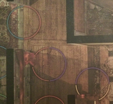
Conversely, in this picture all five circles are supposed to share a light blue color; the entire circle on the right two, and portions of the bottom or bottom right on the left two. To me, the two circles on the right are decidedly more lightly colored than the portions of the circles on the left.
Human perception causes colors to seem different depending on their surroundings, as our brain is attempting to compensate for differences in lighting, and the thin, muted colors are particularly prone to this. The same solution as before applies: more vivid colors and wider lines.
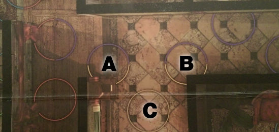
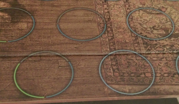
A section of map as it appears on the game board.
Characters can move from circle to "adjacent" circle. What's adjacent? Often it's obvious, but there are exceptions. See the circles marked A and B, above? They seem adjacent to me, and seem a reasonable path for a character trying to hustle down the hallway. However, a character actually needs to travel through C. It's enough of a problem that the Revised rules includes maps with lines showing all of the valid connections.
The same section of map as it appears in the Revised rules.
The solution is to add the linking lines, like they are in the Revised rules.
Combining these adjustments, we end up with this:
| Before | After |
|---|---|
|
 |