I find data visualization fascinating. I'm a big fan of Tufte. (For other information visualization sites I read, check out the "Information Display" section of blogroll.) I enjoy seeing great visualizations, and I want to create great visualizations. Regrettably, my job and hobby don't provide a lot of opportunities for either. So I was very pleased to come across this simple, hand-made graph that I think stands up well against the best.
(Copyright 2000ish by Patti. Used with permission. The creator would prefer to maintain her anonymity online. To remove identifying features, I've had to remove the label near the top that essentially said "before weight loss program vs on weight loss program" in blue and red to match the lines. I've also had to lighten the image so much that the vertical lines almost disappear; in the original they are subtle but easy to see.)
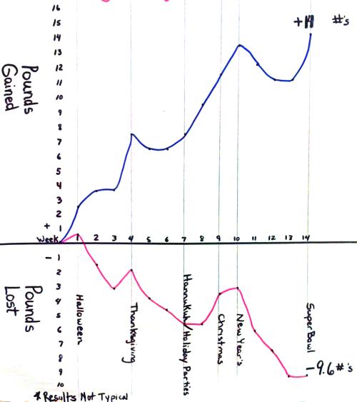
It's a simple graph, hand drawn on a presentation pad lined with one-inch squares.
Part of the graph's strength is its simplicity. No chartjunk (Backup link). A very high data ink ratio. (Backup link)
The graph's real strength is the story that it tells. This is Patti's real data from before and after she began a specific weight loss program. Indeed, the graph shows the strong difference in before and after; an clear advertisement for the program. But there is more. You can see the impact of various holiday celebrations on her weight. Obviously the holidays lead to her gaining weight before. But more interestingly, the holidays were tough on her when she was dieting, but they were only temporary blips in succesful weight loss. The graph tells this story better than text does.
What could be better? A few things leap to mind: 1. The labels for the lines could have been right next to the lines themselves. 2. The chart doesn't actually tell us whose data it is; I had to ask Patti to learn that it was her own measurements. It adds a lot to the authority of the data to know that it's the presenter's own data. 3. While much harder to collect, it would have been nice to have data for a larger set of people in the same situation to show that while "Results not typical," they're not wildly unrepresentative.